IELTS Writing Task 1: comparing pie charts
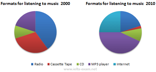
Look at the following pie charts and decide if the sentences are true or false.

1The pie charts show how many people listened to music in 2000 and 2010.
2The pie charts show the proportion of songs played on different formats in 2000 and 2010.
3More people listened to music on radio in 2010 than in 2000.
4In 2000 nearly a third of songs were played on cassette tape but this amount decreased to about two per cent in 2010.
5The proportion of people listened to music on CD was about the same in 2000 and 2010.
6There was a slight increase in the number of people listening to music on MP3 player from 2000 to 2010.
7In 2000 no one used the Internet to listen to music but in 2010 people used the Internet to listen to a quarter of the total songs.
8In 2010 approximately half of the songs were played using two formats: MP3 player and CD.
9From 2000 to 2010 the number of people listening to music on radio decreased by just over 25 percent.
10From 2000 to 2010 the number of people listening to music on radio decreased to approximately half.
Test Tip
Note the way we use prepositions with numbers and dates:
2000 40%
2010 25%
In 2010 the number decreased to 25 per
cent. (40 -> 25)
In 2010 the number decreased by 15 per
cent. (40 – 15 = 25)
In 2010 the number decreased from 40 per
cent. NOT in 40 per cent.
The number dropped to 25 per cent between
2000 and 2010. (40 -> 25)
By 2010 the number had fallen to 25 per
cent.