IELTS Writing Task 1 #124
IELTS Writing Guide
For IELTS Task 1 there are sometimes two or three pie charts that you must compare. The pie charts may represent different years and show trends over time. You need to describe the changes and similarities / differences between the pie charts.
Related Topic:
Comparing pie charts
You should spend about 20 minutes on this task.
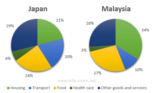
The pie charts below show the average household expenditures in Japan and Malaysia in the year 2010.
Summarise the information by selecting and reporting the main features, and make comparisons where relevant.
Write at least 150 words.

Read the following model answer. Complete the answer by filling the gaps with a word from the box below.
Model answer
The pie charts show the proportion of money spent on various household expenses in Malaysia and Japan in 2010.
We can see that in Malaysia the greatest proportion of expenditure (34%) was on housing, in Japan housing accounted for just 21% of the total. , in Japan the greatest single expense was other goods and services at 29%, 26% in Malaysia. Food came in second place in Japan, at 24%, while in Malaysia the actual proportion was (27%). In Japan another major expense was transport, at 20%, but this was much In Malaysia (10%). In both countries the percentage of expenditure was on health care.
, the data that in both cases food, housing and other goods and services were the expenses, that in Japan, transport and other goods and services took up a proportion of total expenditure in Malaysia.