IELTS Writing Task 1 #173
IELTS tip
When comparing two charts, we need to find which numbers you can compare because they are similar and which numbers you can contrast because they are different. Examples of this are high and low numbers, and numbers which show little or no change.
You should spend about 20 minutes on this task.
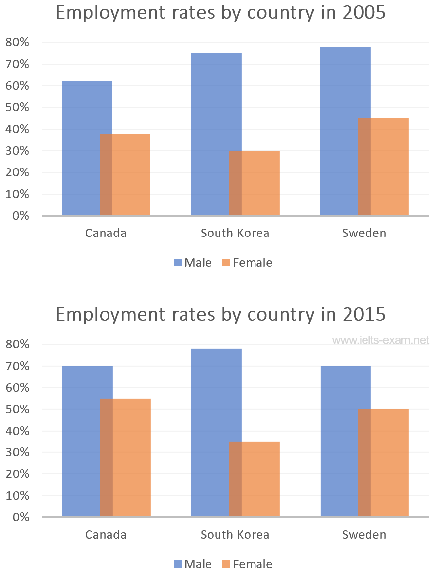
The bar charts below show the percentages of men and women in employment in three countries in 2005 and 2015.
Summarise the information by selecting and reporting the main features, and make comparisons where relevant.
Write at least 150 words.

Model answer
The two charts show the percentages of men and women in employment in three countries in the years 2005 and 2015. In general, we can see that the percentages of working people increased, with the proportion of women showing the most significant rise.
In all of the countries covered, and in both years, the number of men in employment was greater than the number of women. South Korea has the highest rate of male employment – approximately 75% in 2005, rising slightly to about 78% in 2015 – and Canada has the lowest – just over 60% in 2005 and 70% in 2015.
The proportion of women in employment was lower than men in all of the countries covered over the two years. It was below 50% everywhere in 2005, but the figures had risen by 2015. In Canada, over half of the women were working, and in Sweden the figure was exactly 50%. In contrast, the number of South Korean women who were working was only about 35% compared with a percentage which was more than double for men at over 70%.
(180 words)