Pie Chart
A pie chart is a circular chart divided into sectors, illustrating numerical proportion. In a pie chart, the arc length of each sector (and consequently its central angle and area), is proportional to the quantity it represents. While it is named for its resemblance to a pie which has been sliced, there are variations on the way it can be presented. The earliest known pie chart is generally credited to William Playfair's Statistical Breviary of 1801.
Pie charts are very widely used in the business world and the mass media. However, they have been criticized, and many experts recommend avoiding them, pointing out that research has shown it is difficult to compare different sections of a given pie chart, or to compare data across different pie charts. Pie charts can be replaced in most cases by other plots such as the Bar Chart.
Sample Questions
What the electricity is used for
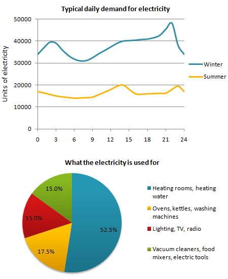
The pie chart shows how electricity is used in an average English home.
Summarise the information by selecting and reporting the main features, and make comparisons where relevant.
Main sources of energy in the USA
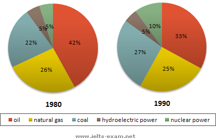
The two graphs show the main sources of energy in the USA in the 1980s and the 1990s.
Summarise the information by selecting and reporting the main features, and make comparisons where relevant.
World Spending and Population

Write a report for a university lecturer describing the information shown.
Summarise the information by selecting and reporting the main features, and make comparisons where relevant.
Percentage of Food Budget Spent on Restaurant Meals
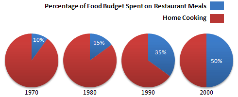
The charts show the percentage of their food budget the average family spent on restaurant meals in different years.
Summarise the information by selecting and reporting the main features, and make comparisons where relevant.
Percentage of European Union funds being spent on different forms of transport
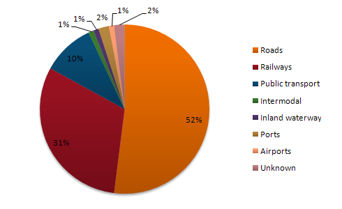
The Pie Chart shows the percentage of European Union funds being spent on different forms of transport.
Summarise the information by selecting and reporting the main features, and make comparisons where relevant.
Death from Flu
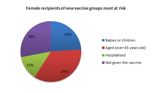
In June 1996, an experimental flu vaccine was trialled in a large country town on females only.
Summarise the information by selecting and reporting the main features, and make comparisons where relevant.
HCT Graduates by College
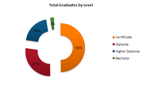
The graphs show enrolment in different colleges in the Higher Colleges of Technology in 1999.
Summarise the information by selecting and reporting the main features, and make comparisons where relevant.
US spending patterns
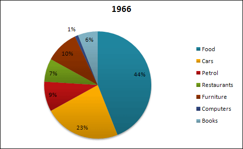
The charts show US spending patterns between 1966 and 1996.
Summarise the information by selecting and reporting the main features, and make comparisons where relevant.
Highest level of education of women in Someland
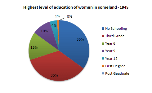
Write a report for a university lecturer describing the information in the two graphs.
Summarise the information by selecting and reporting the main features, and make comparisons where relevant.
Sales and share prices for Coca-Cola
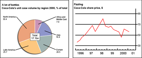
The chart and graph give information about sales and share prices for Coca-Cola.
Summarise the information by selecting and reporting the main features, and make comparisons where relevant.