Bar Chart
A bar chart or bar graph is a chart that uses either horizontal or vertical bars to show comparisons among categories. One axis of the chart shows the specific categories being compared, and the other axis represents a discrete value. Some bar graphs present bars clustered in groups of more than one (grouped bar graphs), and others show the bars divided into subparts to show cumulate effect (stacked bar graphs).
Sample Questions
Estimated sales of jeans next year in Turkey
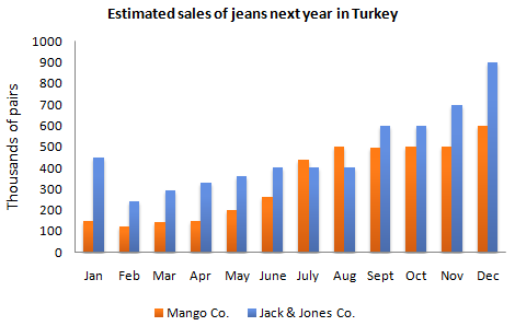
The bar chart shows the estimated sales of jeans for two companies next year in Turkey.
Summarise the information by selecting and reporting the main features, and make comparisons where relevant.
Estimated maximum population of Asian elephants The graph shows
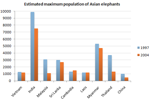
The graph shows the changes in maximum number of Asian elephants between 1994 and 2007.
Summarise the information by selecting and reporting the main features, and make comparisons where relevant.
GDP growth
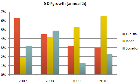
The chart shows the GDP growth per year for three countries between 2007 and 2010.
Summarise the information by selecting and reporting the main features, and make comparisons where relevant.
Percent of Total Population Age 65 and Over: 1900 to 2000
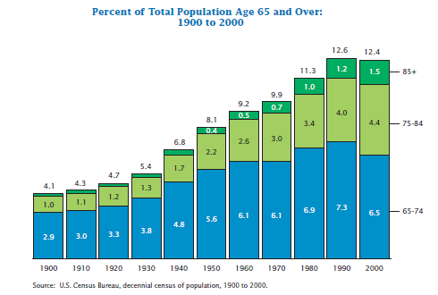
The chart shows the percentage of total US population aged 65 and over between 1900 and 2000.
Summarise the information by selecting and reporting the main features, and make comparisons where relevant.
Fitness Membership
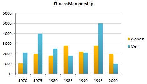
The chart shows male and female fitness membership between 1970 and 2000.
Summarise the information by selecting and reporting the main features, and make comparisons where relevant.
Average percentage number of reported challenges per person
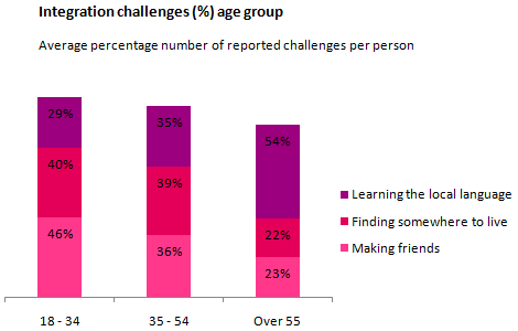
The chart shows information about the challenges people face when they go to live in other countries.
Summarise the information by selecting and reporting the main features, and make comparisons where relevant.
Films screened in the UK and Australia, 2001
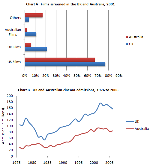
The charts A and B show the share of the UK and Australian cinema market in 2001 and cinema admission in the UK and Australia from 1976 to 2006.
Summarise the information by selecting and reporting the main features, and make comparisons where relevant.
The number of girls per 100 boys enrolled in different levels of school education
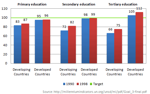
The chart below shows the number of girls per 100 boys enrolled in different levels of school education.
Summarise the information by selecting and reporting the main features, and make comparisons where relevant.
The number of men and women in further education in Britain
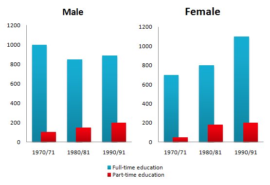
The chart shows the number of men and women in further education in Britain in three periods and whether they were studying fulltime or part-time.
Summarise the information by selecting and reporting the main features, and make comparisons where relevant.
Proportions of the world's oil resources
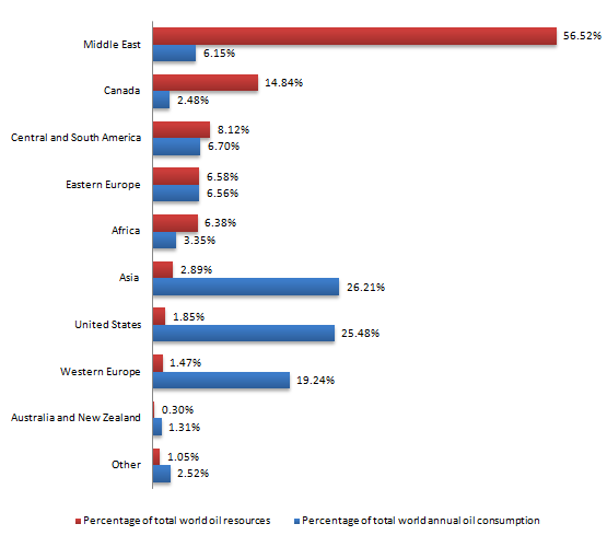
The chart shows the proportions of the world's oil resources held in different areas, together with the proportions consumed annually in the same areas.
Summarise the information by selecting and reporting the main features, and make comparisons where relevant.