Bar Chart
A bar chart or bar graph is a chart that uses either horizontal or vertical bars to show comparisons among categories. One axis of the chart shows the specific categories being compared, and the other axis represents a discrete value. Some bar graphs present bars clustered in groups of more than one (grouped bar graphs), and others show the bars divided into subparts to show cumulate effect (stacked bar graphs).
Sample Questions
Employment Rates, by Country, 1995 - 2005
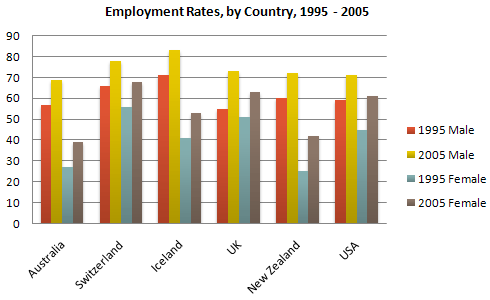
The chart shows the employment rates across 6 countries in 1995 and 2005.
Summarise the information by selecting and reporting the main features, and make comparisons where relevant.
Who Uses the Internet?
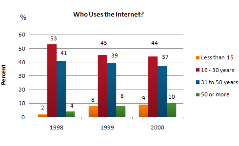
The graph shows Internet Usage in Taiwan by Age Group, 1998-2000.
Summarise the information by selecting and reporting the main features, and make comparisons where relevant.
HCT Graduates by College
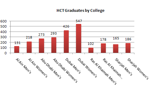
Write a report for a university lecturer describing the information.
Summarise the information by selecting and reporting the main features, and make comparisons where relevant.
Oil Production Capacity
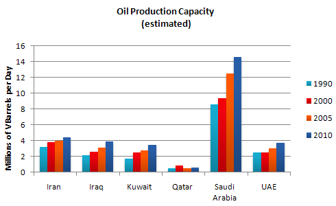
The graph shows estimated oil production capacity for several Gulf countries between 1990 and 2010.
Summarise the information by selecting and reporting the main features, and make comparisons where relevant.
Heart Attacks per year, USA
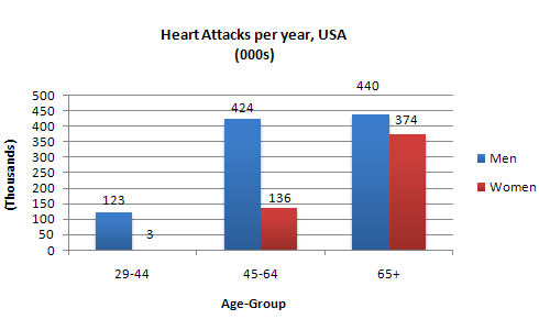
The chart shows information about Heart Attacks by Age and Gender in USA.
Summarise the information by selecting and reporting the main features, and make comparisons where relevant.
Reasons for study according to age of student
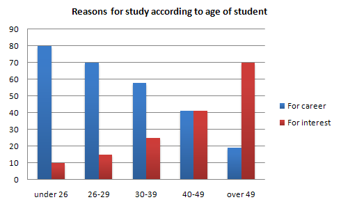
The charts show the main reasons for study among students of different age groups and the amount of support they received from employers.
Summarise the information by selecting and reporting the main features, and make comparisons where relevant.
Amount spent on six consumer goods in four European countries
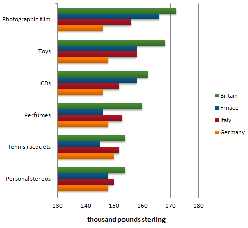
The chart shows the amount spent on six consumer goods in four European countries.
Summarise the information by selecting and reporting the main features, and make comparisons where relevant.
Japanese tourists travelling abroad
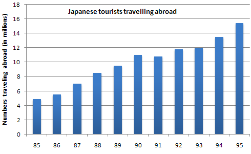
The charts show the number of Japanese tourists travelling abroad between 1985 and 1995 and Australias share of the Japanese tourist market.
Summarise the information by selecting and reporting the main features, and make comparisons where relevant.
Expenditure on Fast Foods by Income Groups, UK 1990
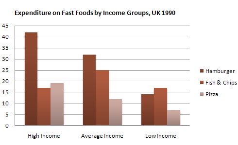
The chart shows the amount of money per week spent on fast foods in Britain. The graph shows the trends in consumption of fast foods.
Summarise the information by selecting and reporting the main features, and make comparisons where relevant.
Fertility Rate (Births per Woman) Gulf Countries 1990 - 2000
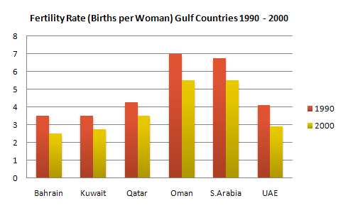
Write a report describing the information in the graph.
Summarise the information by selecting and reporting the main features, and make comparisons where relevant.